26 June 2013

Easy, Durable, Take-With-You-When-You-Move Growth Chart

I found this guest post I'd written, oh, probably almost two years ago.  The blog I guest posted on doesn't seem to exist anymore, so I guess I'd better repost my tutorial here!  Well, without further ado, here's my Easy, Durable, Take-With-You-When-You-Move Growth Chart.

. . .

Hi, everyone!  I'm Jill from Jill Made It, and I am really excited to be here today!  I love creating things, designing new things, and generally making my little world a prettier place.  I also love teaching people the things I learn, hence writing tutorials!

When my siblings and I were growing up, my mom kept track of our heights on growth charts.  Unfortunately, the early ones were made of paper and didn't survive.  Next, she marked our heights on a door...and then we moved.  Now that I'm a mommy, I want to keep a record of my munchkin's height, too, but in way that will withstand life in general.  So I came up with the Growth Stick.


(Yes, it's intended to be hung on the wall, but I couldn't get any good pictures outside.)

It is so easy and cheap, yet it will last right near forever.  Love that kind of project.

All you need to make it are:
 a 2x4x6 length of wood
sandpaper
some semi-gloss paint (mine was leftover from refinishing a dresser, which made this project even cheaper!)
two sharpies or other permanent markers (one fat, one medium or thin) 
a paintbrush (a large foam one)
a yardstick
and picture hanging hardware of your choice

First, sand down your board.


(Don't be like me and fail to realize your board needs sanding until after the first coat of paint.)

Paint all sides except the back.  (It'll never be seen anyway.)

Now take your smaller sharpie and mark the center of your board (longways--you know, like a hotdog).  You'll want to mark it near the top (but not at the very top--you'll see in a minute), then at the bottom and middle. These are just little marks to make sure you get your line straight.  (Sorry I forgot to take a picture of this.)

Next, use your yardstick and fat sharpie to connect these marks into one nice, straight line.


Use the space you saved at the top for your title.  I tried to come up with something cute, but decided to go with simple instead.


The next step is to mark your measurements.   First, determine how high on the wall you want to mount the growth chart.  I think we picked 7 inches off the floor.


This is the main reason for the skinny sharpie.

Make any touch-ups.

Mount your hardware, then hang your brand-new, super-durable, highly transportable growth chart.

Now all that's left is to mark everyone's heights!

19 June 2013

Design My Own Skirt Results, and New Designs to Vote On!

I'm so glad you guys voted on my skirt designs!  I was afraid no one would.  So, thanks!!  

 And the winning design, with 8 votes, is...


Coming in close second with 7 votes was... 

I'm going to have to get out to the fabric store this week!  I may even make both skirts...I plan to have the one skirt done in two weeks when I announce the next winning design.

Now for the next set of designs!  I've never made a swimsuit before, so this will be an interesting experience.  It looked pretty easy from the tutorials I read, and I'm going to try!

I found this pretty chevron fabric on Girl Charlee that I think I'm going to go with.  

Which design do you like best?


#1--I think asymmetry is interesting (you may have guessed by the clothing I made for Project Sewn, with my green "signature look" dress, asymmetrical draped shirt, and the high-low skirt).  So I wanted to try a one-shoulder swimsuit.


#2--I really like this design.  I feel like swimsuits tend to make my already smallish bust seem even smaller.  I think the gathering at the front and the band under the bust will help with that.


#3--Here's another one-shoulder look.  I'm not quite sure which one I prefer.  I like the contrast and interest of having the black on the bottom of version 2, but I think it does make the suit look more sporty, and I'm not exactly planning on doing laps down the pool while I'm holding a baby and keeping a close eye on a preschooler...


#4--I really like this design also.  It has gathering in front and the band under the bust like #2, so I think it will be flattering for the same reasons.  I also like how this halter is high  in the front, since halters tend to be low-cut, so it's different.

 All right, those are my ideas!  Voting is open now, and will be for two weeks.  I'm excited to know what you guys think of these designs!  Feel free to write comments as well as vote.  (Hint, hint!  :D)

10 June 2013

DIY Burp Cloths

Ready for a non-clothing project?  Just to make sure this blog isn't completely taken over by clothes-sewing.  :)  I made these for a baby shower a couple of months ago and hadn't gotten around to posting them yet.


Since Daddy's Girl was born, I've had less time for projects, as you can imagine!  So even though I like making tutorials for all of you, the choice has been between making a tutorial and actually finishing a project.  Obviously tutorials lost.  This project is super-simple, though, so here's a mini-tutorial.

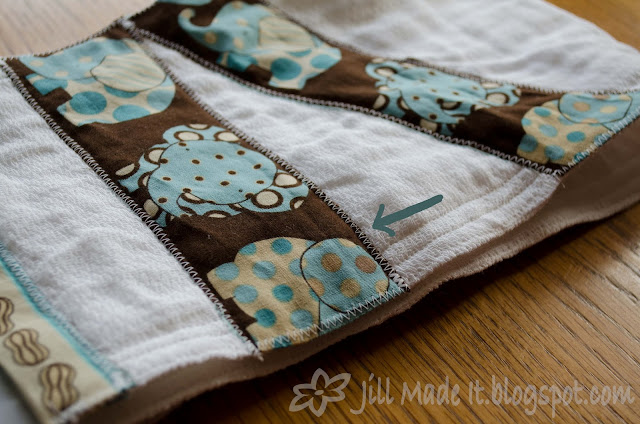
Start off with a couple of plain cloth diapers.  (I got mine from Walmart, in the baby section.)  Get the pre-folded kind, though, unlike me, since they wrinkle less and are a good burp cloth shape to start with.  Decorate with some scraps of cute fabric, and you're done!


I just zig-zag appliquéd these cute little elephants onto the burp cloths, like in this tutorial, only simpler, since it's just a rectangle!  For a more finished look, I also bound the two short ends of the cloths with some non-bias cut 'bias tape' made from a different part of the same fabric scrap as the elephants.

If you need a little help with binding or zig-zag appliqué, click below.  


Now, since you're binding only two edges, rather than all four, it will be a tiny bit different than in the quilt binding tutorial--just cut the bias tape an inch longer than the length of the side you're binding, fold the two short sides 1/2" in so it ends up the same length, and then proceed as normal.

05 June 2013

Design My Own: Wear to the Playground Skirts

You know what I realized?  It's much harder to design clothing for yourself than for someone else.  I whipped out lots of ideas for my sister to choose from during Project Sewn (click to see my skirt, sundress, shirt, and other dress if you missed them before), but when it came time to design MY OWN clothes for my new project...so much harder.  I think it's because, sewing clothes for someone else, I was only in it for the experience--my sister paid for the fabric and got the clothes at the end.  But this time I'm more invested.  

{On a related note, I decided that I will not necessarily make the winning design each month; I was too stressed trying to come up with four ABSOLUTELY PERFECT ideas so that I would be completely thrilled with whatever design won the vote.  I did come up with four that I love, so I will probably make the winner, but not promising I will every time.}

After scrapping two completely different themes and lots of sketches, I decided that for my June project, I would: 

Design a Playground Skirt

That is, I wanted a skirt casual enough to wear sitting on the grass, having a picnic at the playground.  Here are my top four designs for you to vote on.  (The poll is on the left sidebar.)

#1--This one is the simplest, and whether or not anyone votes on it, I'll probably make it anyway to test my pattern before trying anything more elaborate.  Simple, a-line, neutral colors to match any shirt--I think I'll be happy with this one.


#2--I like this idea because of the pocket.  I don't like having things in my jeans pockets because they make these funny bulges right where no one wants funny bulges, you know?  But I have to put my phone somewhere.  (Without having to dig through the diaper bag and get to the phone in time to see I missed the call.)  With this skirt, though, I can keep my phone in the cargo pocket.  No funny tummy bulges, no missed calls.  

#3--This skirt could double for date night, while still not being overkill for the playground.  I don't like for skirts to gather from the waist (tummy bulges, again), so I designed this skirt with a fitted yolk, and the gathers start from the hip or so.  I think Boo would like this one best--she likes ruffles and other "fancies."


#4--(Another skirt that can do double-duty for date night!)  I love polka dots.  I couldn't decide if this one should have all big dots, or little dots on the yolk and big dots on the skirt...What do you think?

So those are my four favorite ideas for this month's project.  Please vote for your favorite!  Voting will close two weeks from today, in the morning of June 19.  You may vote for more than one skirt, if you wish.

{By the way, I *may* make patterns for the winning skirt.  I haven't tried pattern grading yet, but I'd like to.  So if you'd like to make one of these yourself, be sure to vote!  And also let me know in the comments.)